Perhaps one of the reasons Pepsi has always been the underdog in the battle with Coke is because of packaging. Packaging is referred to many as the fifth P because of its immense influence in marketing and convincing a customer to buy a product.
 Coca-Cola originally came in a glass
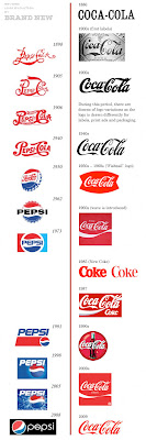 In the 1900s, when it started labeling rather than embossing the glass bottle, Coke came up with the logo that is the ancestor of the design today. Pepsi, on the other hand, started out labeling its product with a colorful design and the words "Pepsi Cola". In 1950, Pepsi introduced its red, white, and blue circle and around 1962, "Pepsi Cola" became just "Pepsi." Pepsi has since constantly gone through many changes in their logo and packaging while Coke has never changed its logo more than basic colors and backgrounds. This reflects the way Coke influences pop culture while Pepsi is influenced by pop culture. Coke remains constant no matter what and thus becomes an icon while Pepsi tries to reach out to people and changing demographics by changing the way it presents itself (its packaging). The only time Coke has dramatically changed its look was when it introduced its New Coke in 1985 but it almost immediately reverted back to its classic logo because the product completely flopped. Pepsi, on the other hand, has radically changed their logo a couple of times. Their current logo is hardly recognizable except the circular image.
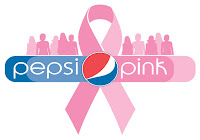 For special occasions, both products change their packaging to appeal to consumers. They have both changed packaging for the olympics, during the holiday season, etc. to relate more to costumers. They use special imagery that symbolizes that event for that purpose. It will make a person want to buy the object for charity (if the companies decide to donate some money for each bottle sold). Such specialized packaging also creates the perception that that product is needed to make the event special. For example, Coke bottles with snowflakes on them make the holiday season seem more special, make it seem Coke cares about its customers and what goes on in their lives, and also that Coke is needed to make the holiday season seem truly like the holiday season.
 Coca-Cola originally came in a glass
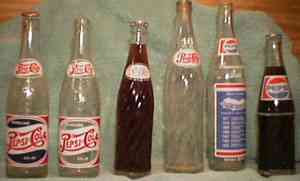
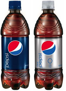
 bottle with its logo embossed in a western style. The original bottle was also straight and had no curves. Starting 1900, Coca-Cola introduced a curved bottle that was easier to hold. In 1915, Coca-Cola bottles took the legendary shape that they still have today. Coke bottles are in fact recognizable even without their labels on them because of this shape. In 1994, plastic replaced glass as bottle material because plastic was much easier and cheaper to mass produce and use as container material. Pepsi Co. on the other hand has changed its bottle packaging constantly and has not followed in a trend, like Coke, but in almost completely different designs. It used to have very large bottles but reduced the size to make holding the bottle more convenient. Pepsi comes in either plastic bottles or aluminum cans now.
In the 1900s, when it started labeling rather than embossing the glass bottle, Coke came up with the logo that is the ancestor of the design today. Pepsi, on the other hand, started out labeling its product with a colorful design and the words "Pepsi Cola". In 1950, Pepsi introduced its red, white, and blue circle and around 1962, "Pepsi Cola" became just "Pepsi." Pepsi has since constantly gone through many changes in their logo and packaging while Coke has never changed its logo more than basic colors and backgrounds. This reflects the way Coke influences pop culture while Pepsi is influenced by pop culture. Coke remains constant no matter what and thus becomes an icon while Pepsi tries to reach out to people and changing demographics by changing the way it presents itself (its packaging). The only time Coke has dramatically changed its look was when it introduced its New Coke in 1985 but it almost immediately reverted back to its classic logo because the product completely flopped. Pepsi, on the other hand, has radically changed their logo a couple of times. Their current logo is hardly recognizable except the circular image.For special occasions, both products change their packaging to appeal to consumers. They have both changed packaging for the olympics, during the holiday season, etc. to relate more to costumers. They use special imagery that symbolizes that event for that purpose. It will make a person want to buy the object for charity (if the companies decide to donate some money for each bottle sold). Such specialized packaging also creates the perception that that product is needed to make the event special. For example, Coke bottles with snowflakes on them make the holiday season seem more special, make it seem Coke cares about its customers and what goes on in their lives, and also that Coke is needed to make the holiday season seem truly like the holiday season.

My favorite packaging is done by Coke. It's such a classic logo and the same one has been used since I was born. It's been there throughout my life so it's familiar and cozy and classic whereas the Pepsi logo seems to be changing all the time; by the time I get used to one logo, it's been already changed. I like Coke bottles, too, for their familiar structure.
Pepsi should get a whole new marketing director. =)
No comments:
Post a Comment